The design of logos have always fascinated me – as a visual expression of the philosophy of a particular institution. It is quite a challenge to encapsulate the inner meaning envisaged by a founder in the aims and objectives of a group of individuals.
I have been particularly fortunate as my interest and growing skills coincided well with the growth of the meaningful visual image of a philosophy during the 20th century. Some of the early historic logos would have been the recognisable images on the Crusaders’ battle shields, later on the small sealing wax images made in the form of a mould worn as a ring.
During my time however, there has been a large rise in the value of an image that can serve many purposes to indicate or instil some prestigious aura around an organisation.
I was fortunate also in joining the ANU Design Unit, in that it brought me into a world of opportunities on which designers must always rely and my record here shows that I was given many chances to challenge my skill in this field.
Here again, simplification is a prime mover in creating a successful image, even though the imagery is not always penetrated to reveal significant meaning by everybody.
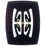
I pay high regard to simple elegance and perhaps the 1982 Veterans Affairs logo is my favourite. It is still in use some 33 years later which is not bad for a government fond of change.
The visual ‘taste’ of the CEO recipient is often a force to be reckoned with and Sir Garfield Barwick, Chief Justice of the Australian High Court was not impressed with my efforts in 1980, but Doug Waterhouse as Chairman of the Board of the Canberra College of Advanced Education was most receptive to my 1968 design that consisted of the five Cs representing the five areas of study in the inaugural College – later to be adopted when it changed to the University of Canberra.
They are great fun, calling for imagination, elegance, persistence and a willingness to discard the many attempts that don’t quite make the grade. The 2002 Biocentre logo was never quite elegant enough – perhaps it was too complicated ?
Moss Cass, Minister for the Environment in the Whitlam Government asked me to design a letterhead logo for a regular publication he wanted to promote when we were both members of Nature and Society Forum and working together on the formation of the Australian National Biocentre around 2003. At that time a lot of nonsense was talked in the media about climate change and global warming and he wanted a logo that distinguished provable sense from all of the nonsense being circulated at that time – and still is in 2016.
I thought my 1972 logo extracted the essence rather well but the publication never eventuated, but the logo has persisted in my mind as a good encapsulation of the thought behind it.
